Usability and interface revamp of Absa.co.za

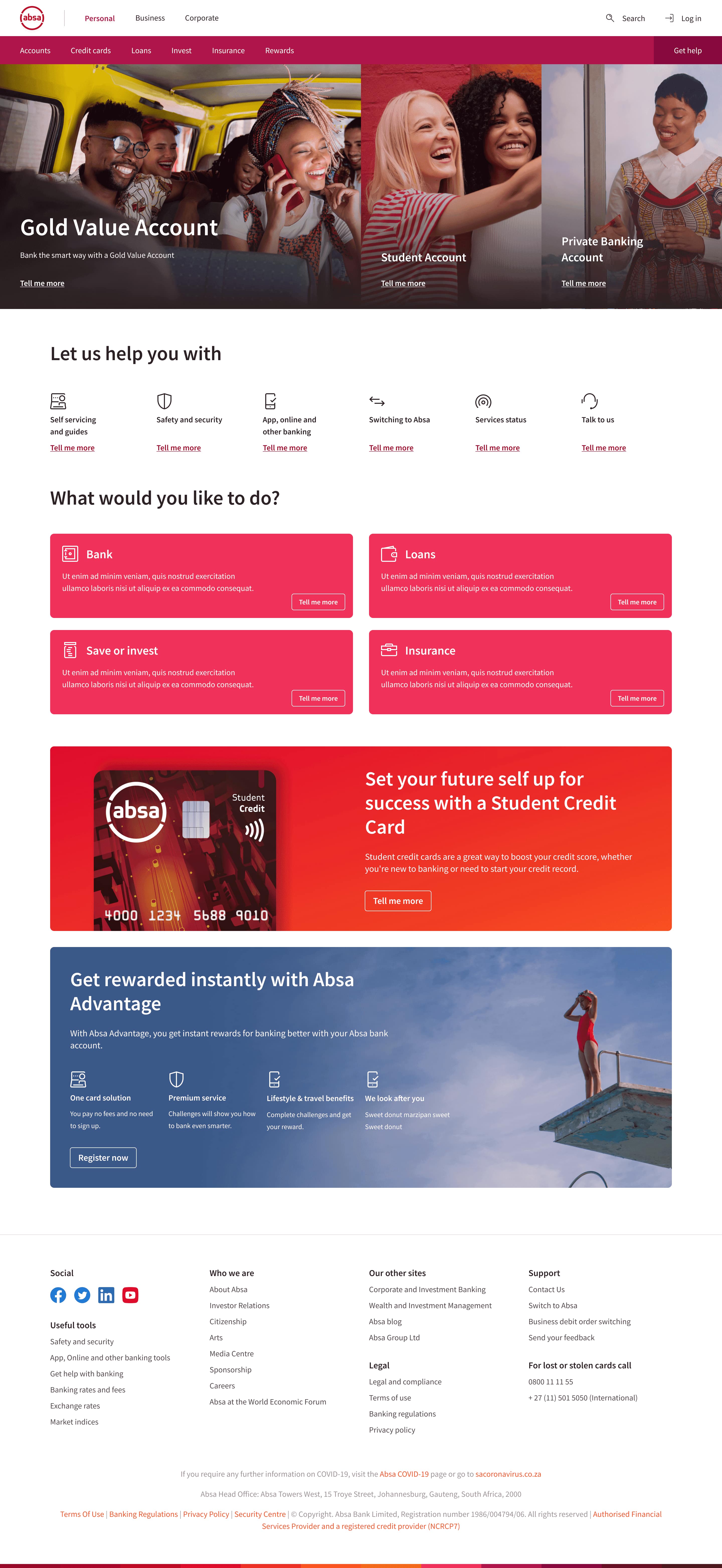
The analytics at the time hinted at the homepage being used as an entry point by most users to get to a screen that contained the desired information. With this information in mind, we set about to create a few methods of navigating the website outside of the standard header and footer.
Links to the most frequently visited content were placed below the hero ad-pieces to allow for quick access and major functions of everyday banking were placed below that for a higher level view of products and services. We also revised the advertising components and create a hero ad-piece for what may need immediate/urgent attention and had block level ad pieces that rotated with every refresh to display information from different departments competing for ad space on the homepage.

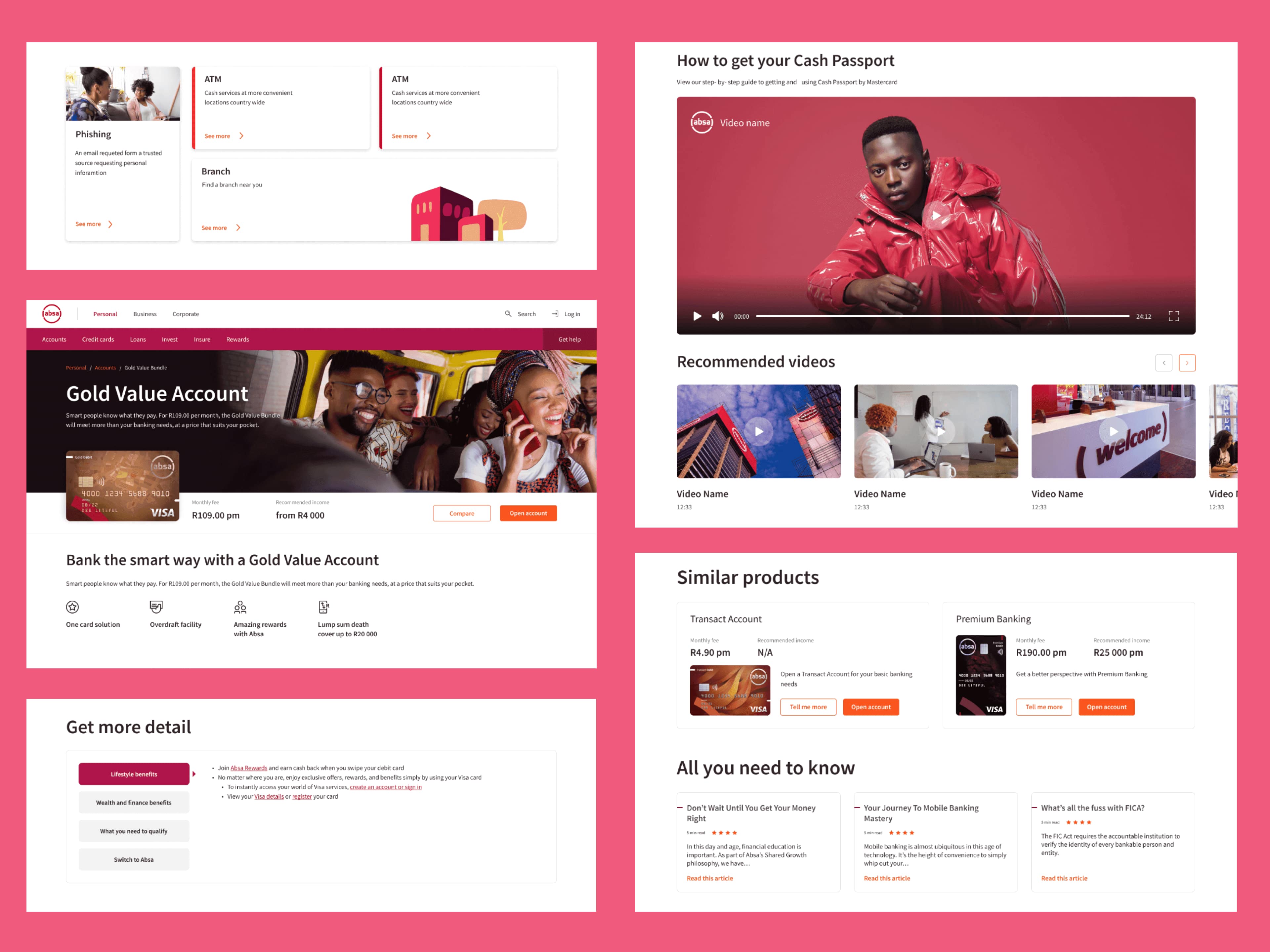
In a similar method to the homepage, we created a number of components to display any and all information types that could be required for a product page. With the myriad of products displayed on absa.co.za, we had to ensure that each component was capable of conveying information individually and would still fit the general aesthetic and usability standards when grouped with other components. We catered to all manner of data (from text to video and images) and confirmed that each component could display the required information either by itself or as part of a full product page.

With the revamp, we were looking to improve decision making processes when it came to choosing the "right" product. As most users did not opt for private banking, we were looking to ensure that they could at the very least get closer to the ideal product using filters and details about the product that they may know about.
If users were not knowledgeable on the products, they would still be able to obtain some information from what we displayed on the product cards and have a comparison point to help them narrow decisions down from a list of (possibly) hundreds of products to a preferred handful.
